A complete brand identity redesign -- stationery to lapel pins to electronic room keys -- for hotel The Franklin, Chapel Hill, N.C., draws on 21st and 18th C. design. It is advertising/branding agency The Republik, Durham's first work for the new client.
The assignment was to refresh the existing logo, now seen as dated ("60s modern") and generic, but not to fully modernize it, as The Franklin itself is both new and old. It's on the bustling main street, Franklin Street, in a lively college town. The sidewalks are populated by young adults. It's a "renaissance" hotel, full of modern amenities. But the clientele is largely students' parents, and the hotel prides itself on its old school attitude. For example, the room phones (which are push-button of course) are designed to look like black, 1940s rotary dials.
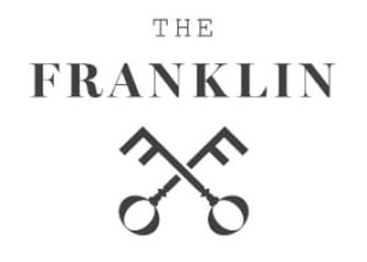
The new logo connects to The Franklin's namesake, which is not, as many assume, the street, but Ben. The initial F?turns into a stylized image of crossed skeleton keys, as in the apocryphal kite-flying experiment. Accompanying typography combines sharp, modern elements (large, ultra-thin serifs), with a classic, engraved-style typeface. On the actual room keys, the logo is on the back with the magnetic strip, and on the front are ten different images of real old keys. Staff wears the new lapel pins.
Creative credits go to The Republik creative director Robert West; art director Matt Shapiro; and designer George Lauinger.
The Republik, Durham-based, is employee-owned. Clients include PrivatizeMe, Fayetteville Area CVB, 21C Museum Hotel, Boy Scouts of America Oconeechee Council, First Flight Venture Center, Lexis Nexis and The Franklin. www.therepublik.net